If the ten richest men sat on their wealth in dollar bills, they would be halfway to the moon – but how do you work that out? In our latest blog for Davos week, Alex Maitland tells us how the Oxfam team came up with some of our mind-blowing wealth stats
In October last year, I received a spreadsheet from Anthony Kamande, a colleague in Nairobi, who had been painstakingly tracking billionaire wealth since the start of the pandemic (you can read his blog about how the super-rich have flourished here). My reply? “Holy moly, the richest 10 men have doubled their wealth!”
Every year a group of colleagues from across the Oxfam confederation gets together to plan how we are going to put into perspective the vast levels of inequality for the annual Davos meeting of the rich and powerful. This had begun in 2014 when Oxfam calculated that the 85 richest people owned as much wealth as half the world – triggering international media coverage and backlash against such inequality. Updating the stat became an annual tradition. Every year, as inequality worsened, this killer fact just got deadlier.
When we opened Anthony’s spreadsheet, which tracked wealth from the Forbes real-time billionaire list, I’m not sure any of us expected that the pandemic had created such a jump in billionaire wealth – the greatest surge since records began in 1987 when Forbes began publishing their list.
The numbers behind our headline wealth stat
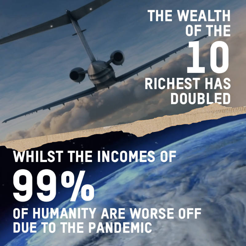
Across the board, billionaire wealth had soared throughout the pandemic, but it was the wealth of 10 men which stood out as the most powerful indictment of how the pandemic had benefited a small group of people. You can see the breakdown we produced for our analysis in this table (You can find it here).
Change in the wealth of the 10 richest men: March 18, 2020 to November 30, 2021

It was pretty clear that we had our leading killer stat. After adjusting the March 2020 figures for inflation using the US Consumer Price Index to make the figures comparable, we had our final calculation:
On November 30, the total figure for the top 10 richest was $1.5 trillion. The total figure for March 2020, inflated to October 2021 prices, is $691.7bn, so an increase of 119%, more than double.
Showing the gulf between billionaires and the rest
However, the job wasn’t over. We needed something to contrast this vast jump in wealth to reflect the hardship of the pandemic for so many and especially for women.
Conversations with inequality and poverty experts at the World Bank had revealed that nearly the whole world had seen a fall in income. To be clear, this doesn’t mean everyone is poorer than when the pandemic began (although many are), but nearly everyone has lower income today than if the pandemic hadn’t happened. The bank’s data showed that the incomes of 99% of humanity are worse off because of COVID-19 (the same data was used for this World Bank blog about inequality).
$1.5tn is a very big number – how do you explain it?
$1,512,300,000,000 – the wealth of the ten richest men – is a big number. Lots of zeros! We needed a way to put this figure into perspective.
Here’s one stat we worked out to do that: if the top 10 billionaires each spent a million dollars a day, it would take them 414 years to spend their combined wealth. How did we do this? Well, 365 days multiplied by 10m ($1m a day each) is 3.65bn. So we took the $1.5123 trillion divided by 3.65bn which equals 414. (This killer fact of course makes no allowance for interest, which could mean they would actually take far longer to spend their fortunes).
Or how about this? If the top 10 billionaires sat on top of their combined wealth piled up in US dollar bills, they would reach almost halfway to the moon. You can understand this via the table below:
The wealth of the top 10 in dollar bills would reach halfway to the moon

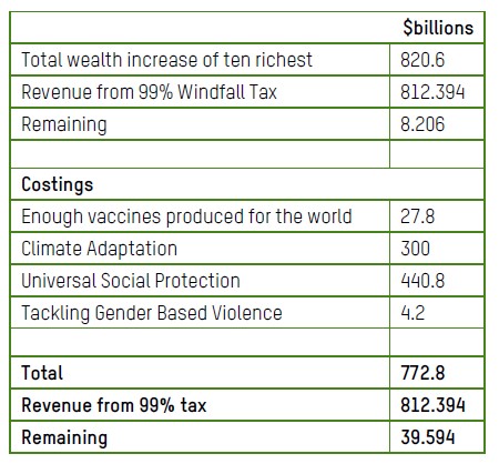
Taxing 10 men could pay for universal vaccines, healthcare for the poor – and more
In the end, what led in our press release were two figures. First, if the top 10 lost 99.999% of their combined $1.5 trillion wealth, they would still all be millionaires and richer than 99% of humanity. If someone with £10,000 lost the same amount they’d have just 10p left.
Second, it turns out a 99% windfall tax just on what these 10 have gained since the start of the pandemic could pay for quite a lot: vaccines for the world (based on analysis of mRNA manufacturing costs by Imperial College London); social protection and healthcare for low- and middle-income countries (according to analysis by the International Labor Organisation), fund Climate Finance gaps (based on data from the UN Environment Programme) and reduce gender-based violence (according to the UN Population Fund). See the breakdown in the table below. I must admit I felt like a finance minister when calculating this stat, telling Nabil Ahmed, the report’s author, what we could and couldn’t afford!
What would a 99% windfall tax on the top 10 pay for?
Gender and wealth inequality
The gender aspect of wealth inequality is often overlooked, and we needed a stat to bring it into focus. In 2018, Credit Suisse had conducted analysis on wealth distribution by gender, which gave us estimates of a total of $6 trillion held by all women in Africa and Latin America and the Caribbean. We filtered the billionaire list to show just men (another painstaking task conducted by Jonas Gielfeldt that also revealed just 11% of billionaires are women and there are more billionaires called Jeff than there are black billionaires) and went down the list until we got to $6 trillion combined wealth. That revealed that 252 men have more wealth than all 1 billion women and girls in Africa and Latin America and the Caribbean.
An important postscript. I’ve only looked at global headline stats above – wherever you are reading this it is likely bespoke statistics relevant to your country or region were covered by your local press, a herculean effort led by Anthony Kamande where cutting edge wealth data for over 40 countries was analysed, producing over 100 bespoke stats.
Every year we end up filling a 50-page report with mind-blowing stats about the state of global inequality. As a team, we probably get over excited and cram in far too much. But if I take one thing from this annual process, it’s probably this: if you throw enough mud at the wall, the best bits will stick.
Author
The Oxfam Davos billionaire stats team was led by Max Lawson and consisted of Anthony Kamande, Patricia Espinoza Revollo, Jonas Gielfeldt, Inigo Macias Aymar, Quentin Parrinello and Alex Maitland
You can find the full report, Inequality Kills here, as well as a comprehensive methodology note outlining how we did the analysis,
This is the fourth in a series of posts for this month’s online Davos gathering on Oxfam’s Views and Voices blog. Subscribe to keep up with the latest posts and also do follow us on Twitter and LinkedIn